Build a Dashboard from Google Sheets
Overview
With Preset you can connect to a multitude of databases and quickly get meaningful insights about your data. Preset comes with a Postgres instance that contains various preloaded example databases, but why not load your own data to familiarize yourself with Preset?
In this walkthrough article we will show how easy it is to connect data to Preset, build charts, and then create a gorgeous dashboard. Specifically, we'll be working with Netflix data stored in a very common medium: the Google Sheet.
By the end of this tutorial your new dashboard will look like this:

Step 1: Connect to the Data
For this walkthrough, we will use Netflix programming data. This data contains almost 8,000 movies and TV shows with a variety of useful information, such as release year, actors, titles, etc.
We have downloaded the data from Kaggle and imported in a Google Sheet that we will connect to Preset:
https://docs.google.com/spreadsheets/d/19XNqckHGKGGPh83JGFdFGP4Bw9gdXeujq5EoIGwttdM/edit?usp=sharing
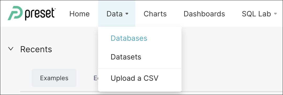
Step 2: Add a Database
Next, we will add the Google Sheet to Preset as a database.
In the Toolbar, select Data and, in the sub-menu, select Databases. This will take you to the Databases screen.
Next, select the green +DATABASE button. The Add database window appears.

In the Database Name field, let’s enter: Gsheet_Netflix_db and, in the SQLAlchemy URI field, enter: gsheets://
It should look something like this:
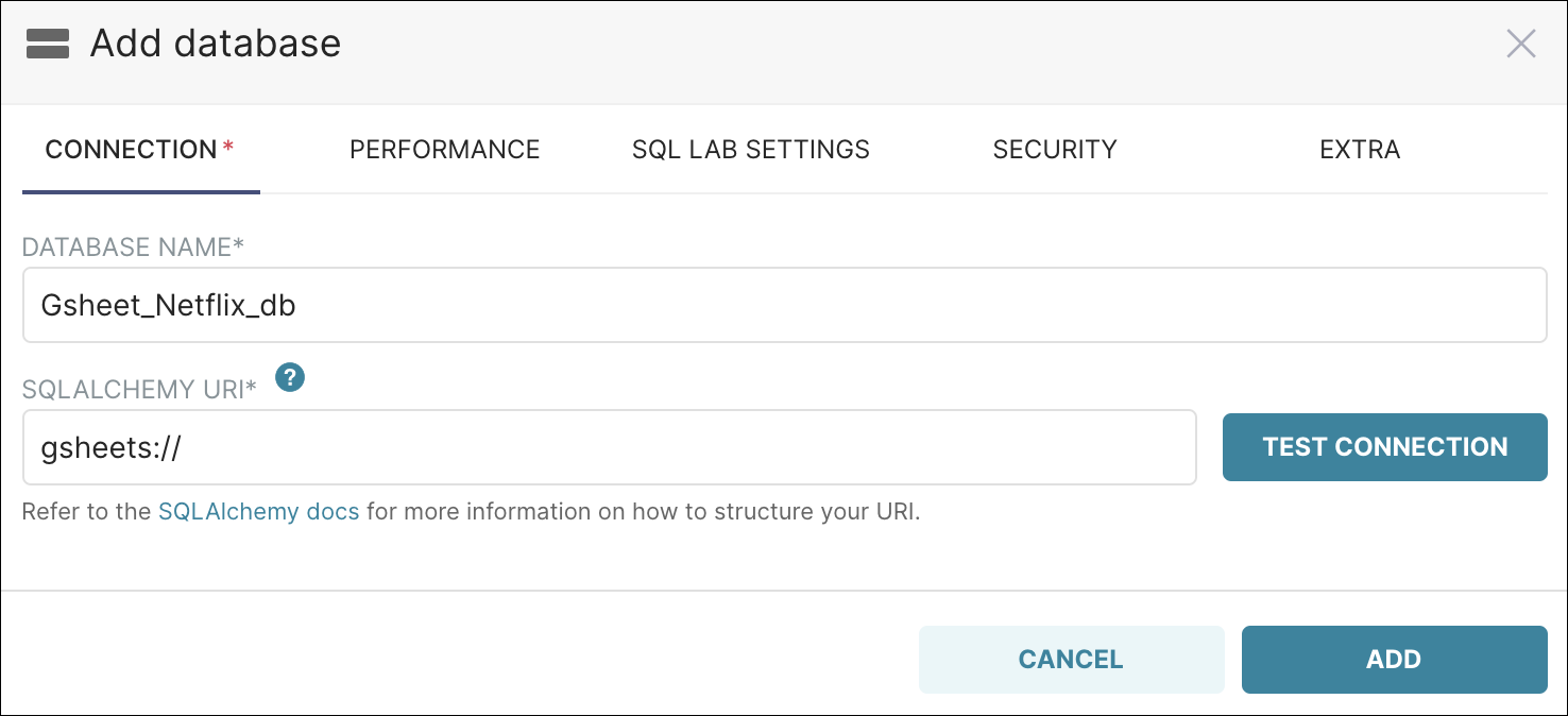
Now let’s go ahead and add the database by selecting Add. The database now appears in the list of databases:

Step 3: Add a Dataset
The building blocks of our data visualization are what we call Datasets and they usually represent tables in databases.
Our next step is to add a dataset to Preset. Later on, we will build our visualizations (charts and dashboards) using this dataset.
Let’s start by selecting the Datasets tab and then, in the top right corner, select +DATASET.
![]()
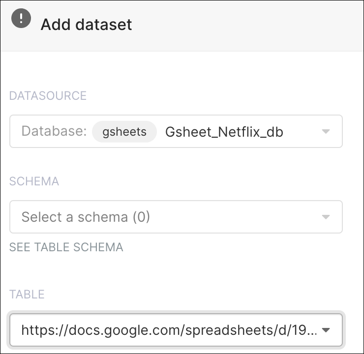
The Add dataset window appears.
In the Datasource field, select your newly-made database: Gsheet_netflix_db
Since we are using a Google Sheet and not a traditional database, there is no need to select an option in the Schema field.
In the Table field, paste your shareable Google Sheet link (need some help? Check out Google’s instructions!).
The Add dataset window should look as follows:
You could use our public GSheet
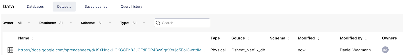
When done, select Add. The dataset now appears on the list and you can click on it to explore.
If you need some help with adding a database and dataset for a Google Sheet, just check out our how-to article here in the Preset documentation!
Step 4: Create a Big Number with Trendline Chart
We are going to create several charts and a filter box based on this dataset, after which we will put those charts in a dashboard so you can get an overview of the different metrics in your data.
To create a chart we can double-click on the dataset we’ve just created and this will take us to the Explore page, as shown below.

The default view is a table of your data showing the aggregate count of records over a week. With Superset you have access to many types of data visualization that suit your specific needs.
Let’s start with a Big Number with Trendline chart — this allows you to quickly identify scale and direction in your data.
In the Visualization Type field, select Table (the default selection) and, in the Select a visualization type panel, select Big Number with Trendline.
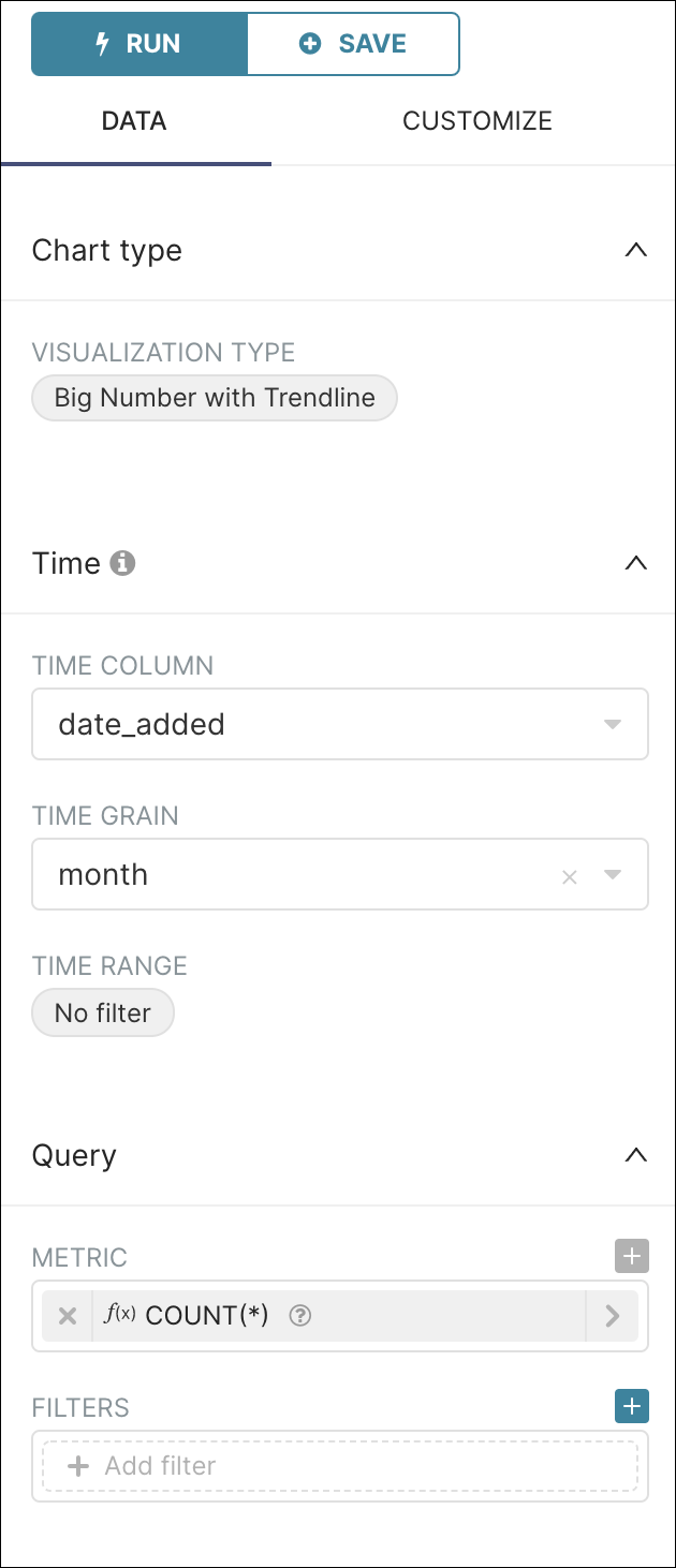
In the Time Column field, select date_added and then, in the Time Grain field, select a time grain of month.
We are going to count the number of movies / tv shows in our table so, in the Metric field, select the saved query COUNT(*) as our metric.
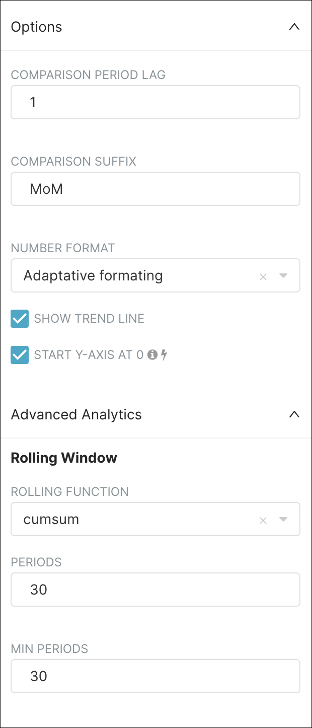
We will count those cumulatively over a rolling period of 30 months. To do this, we will complete the Rolling Window by completing fields in the Options and Rolling Window sections, as follows:
Lastly, select Run Query to see the results. The results should look as follows:

The top part of the screen displays the graph (the title can be changed by simply clicking on it) and the lower part of the screen displays the data results of your query.
Step 5: Create a Dashboard
A dashboard is a visual representation of multiple sets of data. In the world of Preset and Superset, a dashboard is a collection of charts. Dashboards have the unique capability to tell a story by combining different types of charts to form a narrative.
We can save the chart we just created and create a dashboard at the same time. Let’s try it!
Start by selecting Save — the Save chart window appears.
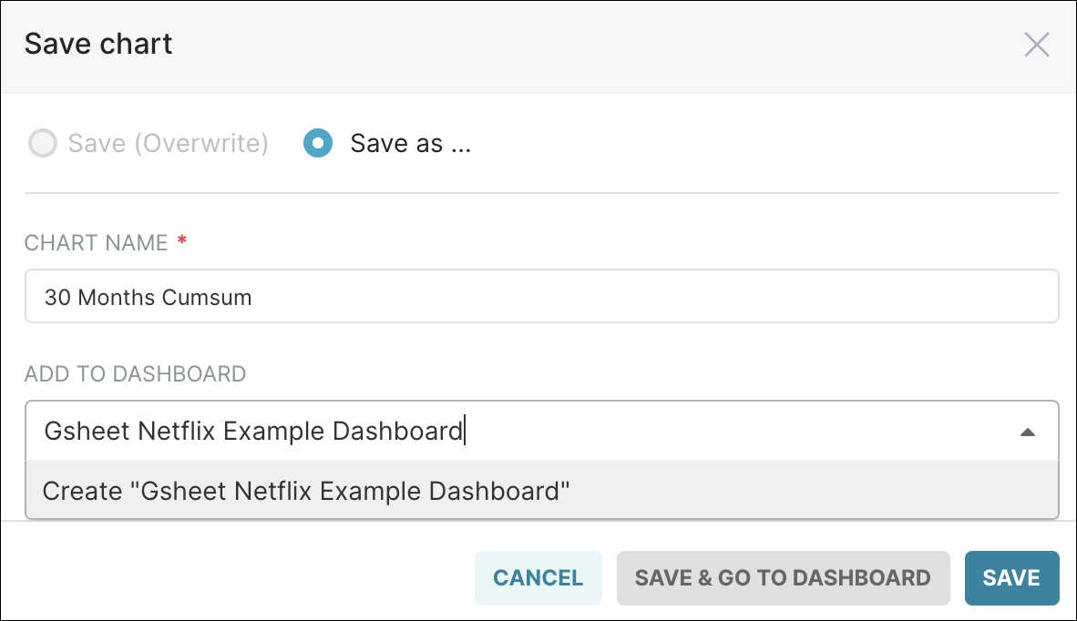
Select Save as and, in the Add to Dashboard field, enter a name for your new dashboard — after entering the name, be sure to select the option Create "<dashboard name>".
Lastly, select Save & Go To Dashboard.
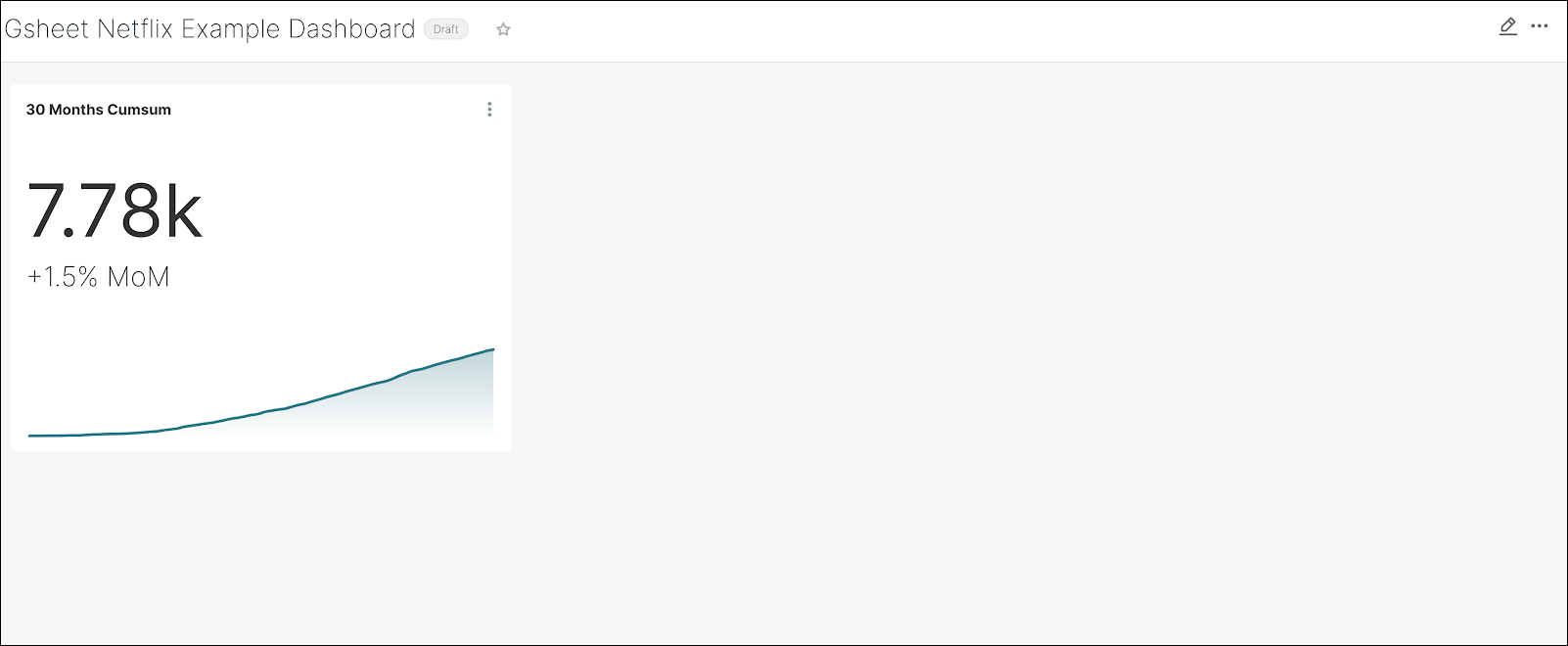
A first draft of your new dashboard appears! It should look similar to the following:
By the way, you can also navigate to Dashboards (in the Toolbar at the top) and then select +Dashboard to create a new dashboard. From there, you can drag & drop your charts to the new dashboard.
Step 6: Create a Dashboard Filter
A dashboard filter is a powerful tool that enables you to filter data in real time on a dashboard — when filtered criteria are selected, all of your charts on the dashboard will be updated! Let’s explore the process.
Let’s return to the Explore page for our GSheet dataset. From the Toolbar, select Data → Datasets, and then select your Google Sheet dataset. The Explore page will appear.
Remember how we used the Visualization Type field to select a Big Trend with Trendline chart? Let’s do the same, but this time select Filter box.
Complete the following fields to customize the new filter box:
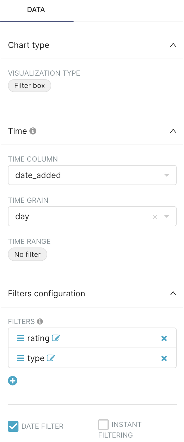
By running the query, we get a Filter Box that allows us to filter by time, rating or type:
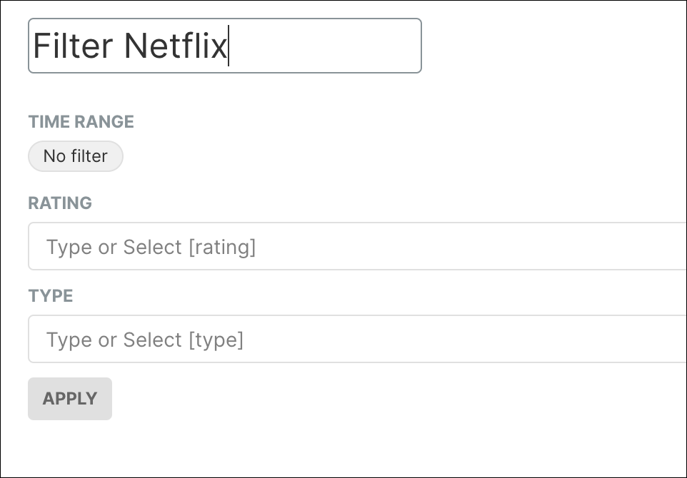
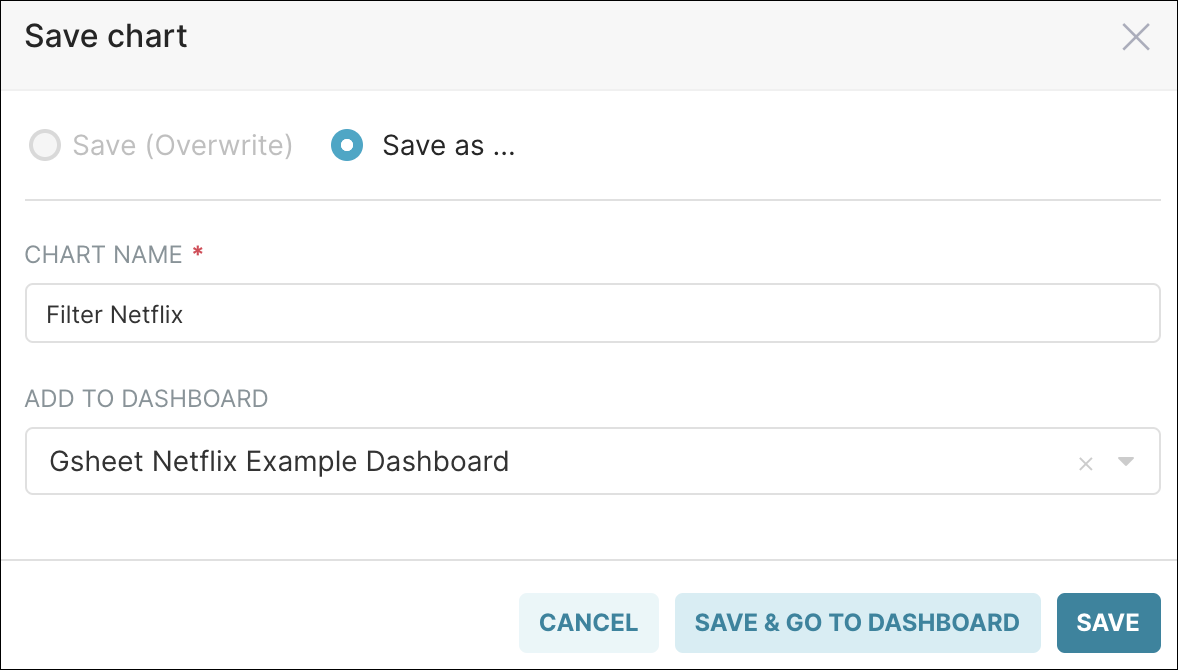
Let’s save this as Filter Netflix and go to the dashboard we created. In the Add to Dashboard field, be sure to select your recently-created dashboard.
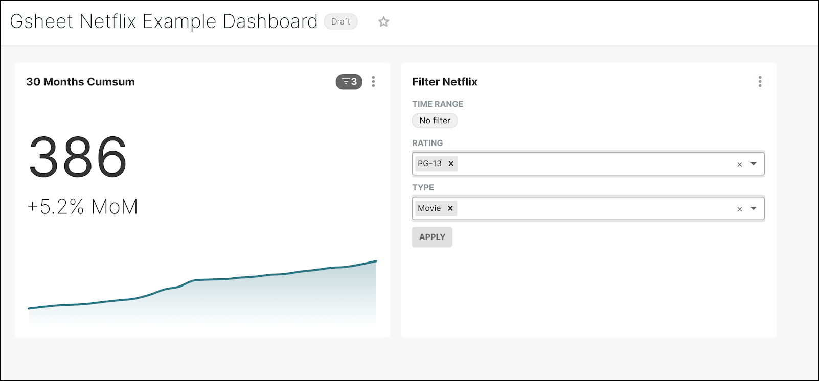
In your dashboard, try applying different filters to see how the data visualization changes.
Step 7: Add a Netflix Logo
Our dashboard so far looks a bit plain and may need some visual customization for more impact. To do this, let’s add a Netflix logo to the dashboard.
Start by editing your dashboard by selecting the Edit pencil icon. Then, under the Components tab, drag & drop Markdown to the dashboard.
![]()
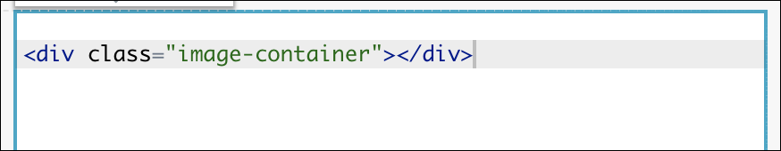
Replace the default markdown text with an html container:
Next, click on the ellipsis icon on the right (3 dots) and select Edit CSS.
In the Live CSS Editor panel, paste the following:
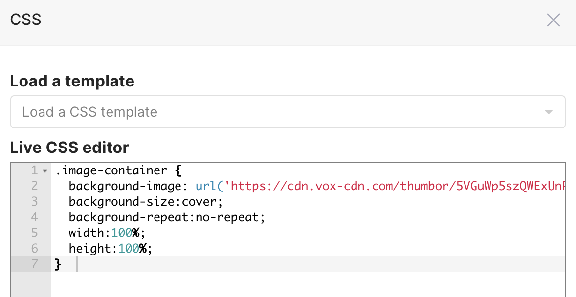
You should get something like this:
![]()
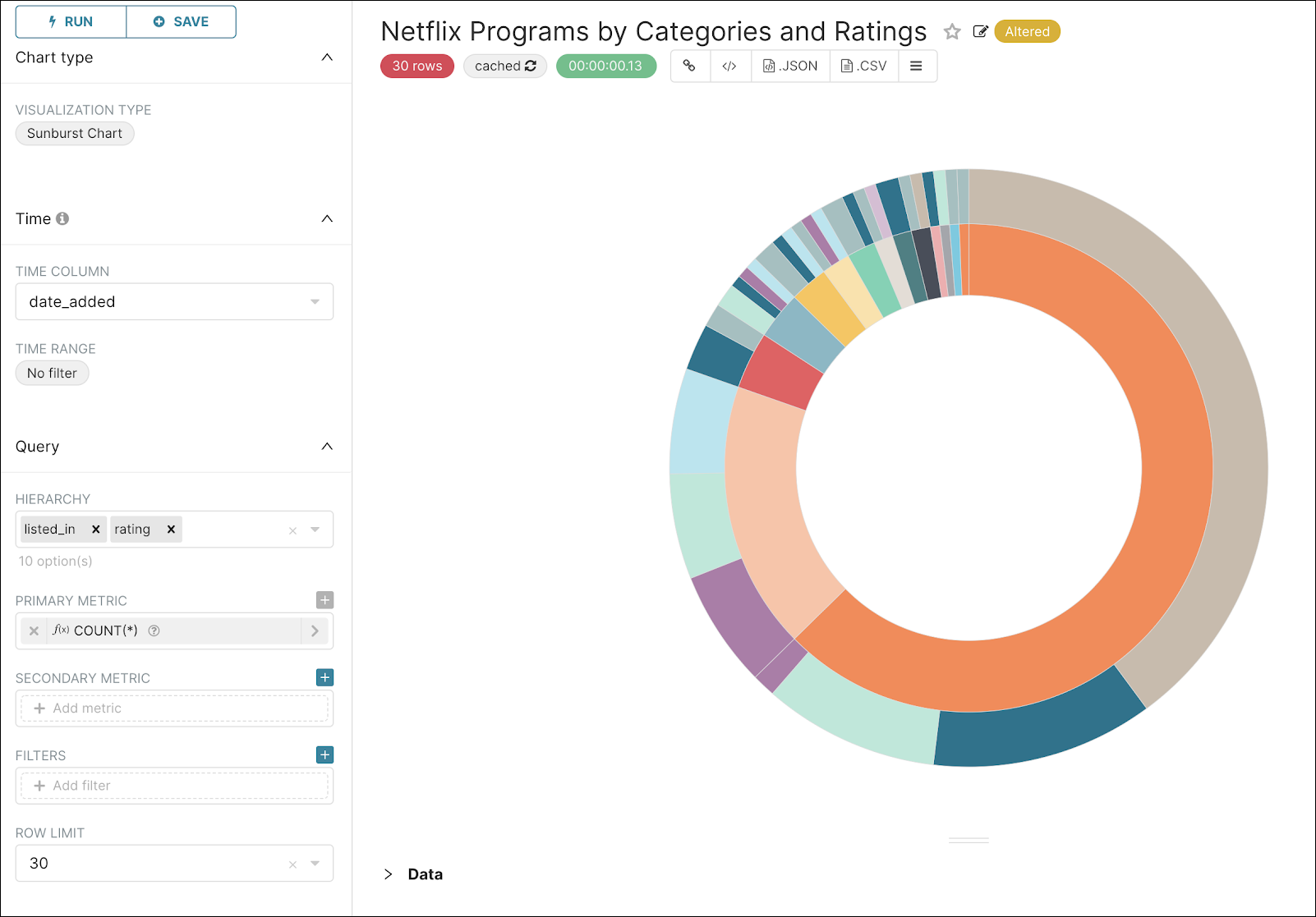
Step 8: Create a Sunburst Chart
Now let’s go back to our dataset and add another chart. We want to see the re-partition of ratings per category.
For this, a Sunburst chart makes an ideal candidate, so let’s create one! Use the graphic below as a guide to configure a Sunburst chart:
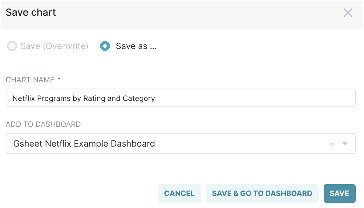
When done, you can save it to the dashboard but opt to remain on the Explore page so that you can create another chart.
You can do this by selecting the Save button (instead of Save & Go To Dashboard) — be sure to create a unique chart name.
Step 9: Create a Pie Chart
Now, let’s add a simple pie chart to see the top 5 categories. Use the settings in the graphic below to create the pie chart:
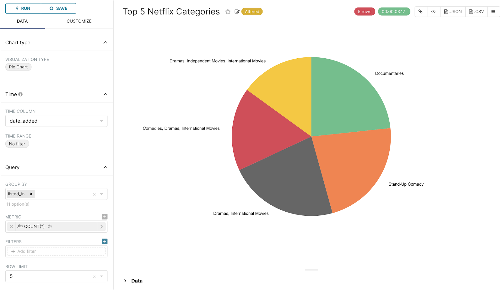
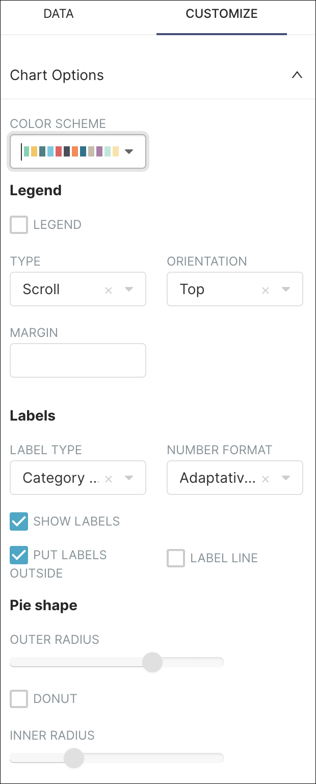
Feel free to select the Customize tab and configure the colors and settings.
Lastly, use Save as to save the chart under a unique chart name and then select Save & Go To Dashboard.
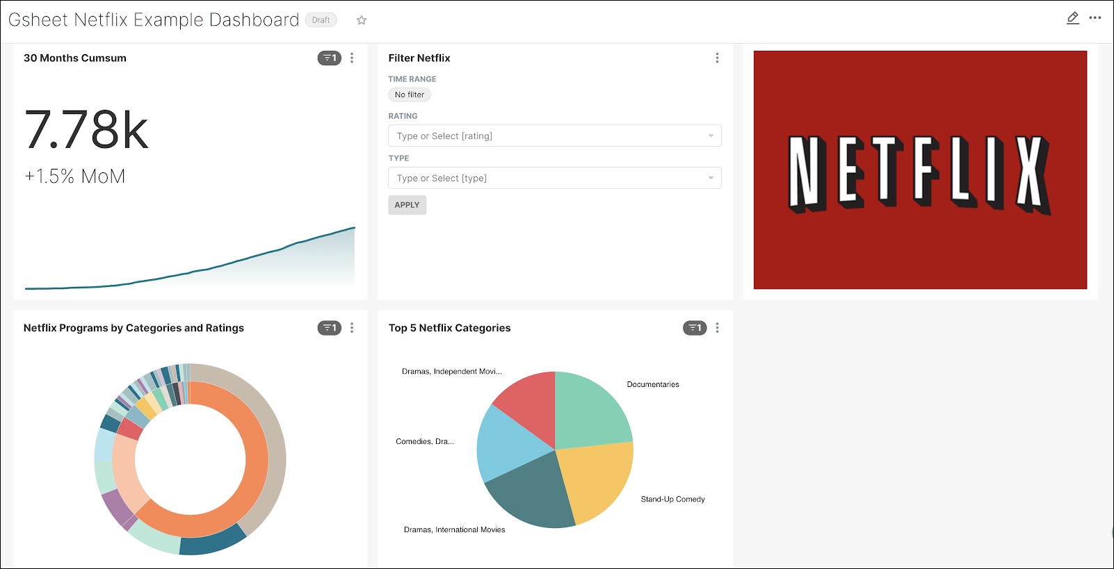
Your dashboard should look similar to the following:
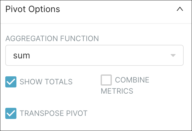
Step 10: Create a Pivot Table
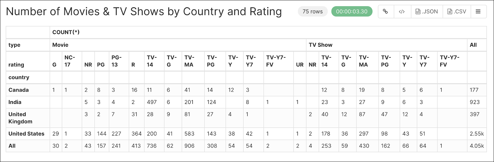
Lastly, we’re going to add a pivot table that will display the re-partition of Netflix programs by country and rating.
Like before, select your dataset and then, from the Explore page, create a Pivot table. Configure your Pivot table as follows:
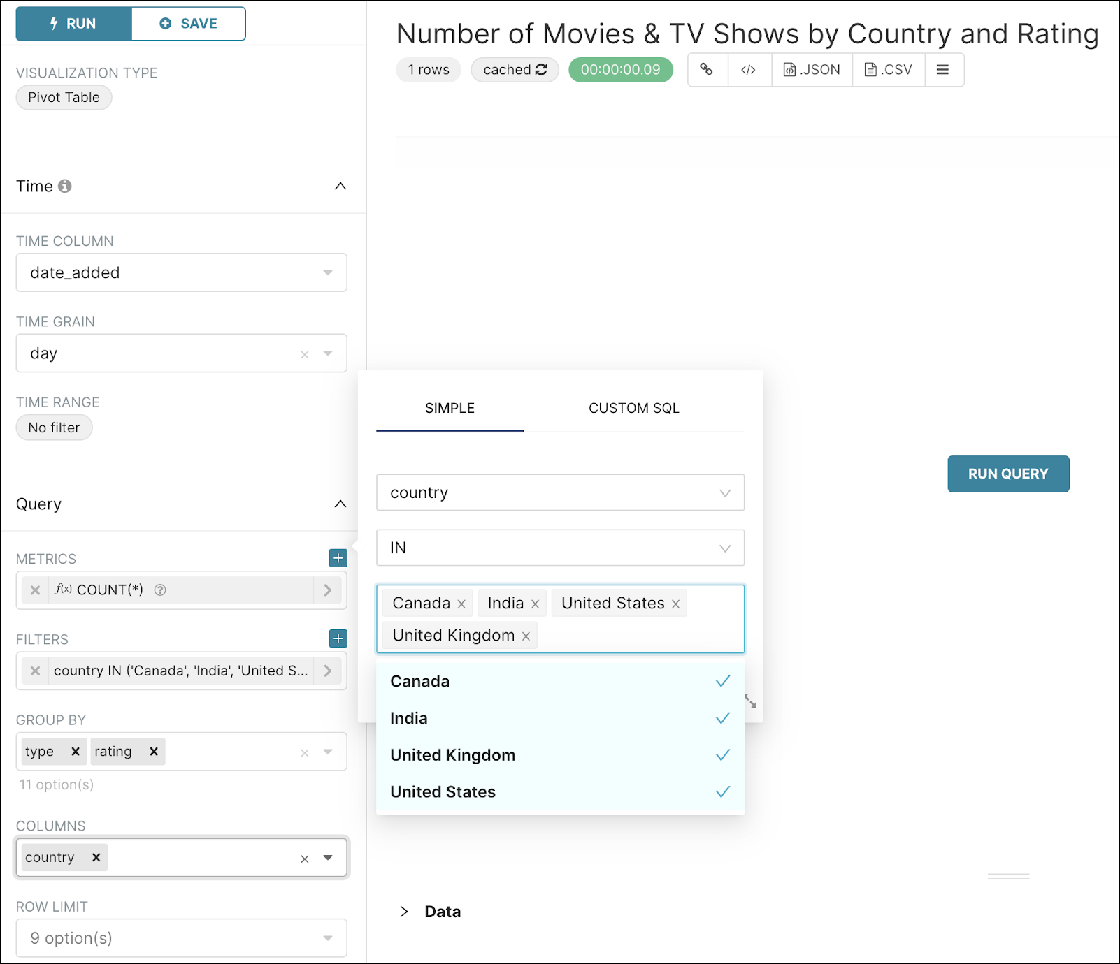
Also, in the Pivot Options panel, complete as follows:
After running your query, the results should look similar to the following. This table displays the number of movies and TV shows by category, rating, and country.
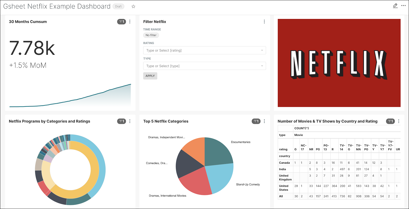
Save the Pivot table and then go to your dashboard. It should appear as follows:
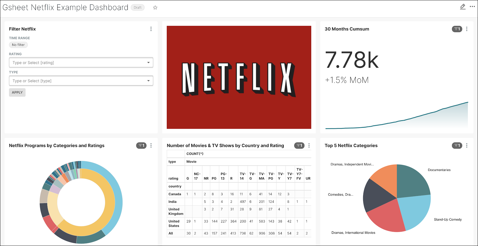
Great job! Now, let’s move some of those charts around so that we have a more user-friendly look & feel.
In the top right corner, select the pencil Edit icon and then drag & drop the charts to match the graphic below.
Conclusion
With Preset, you can get a good looking, filterable, and insightful dashboard up and running in a matter of minutes. Dashboards are powerful tools that enable you to make sense of your data and provide strong visual support for stakeholders in your organization.
Now that you are connected to your Google Sheet data, why not try to connect to your database of choice and start building some more amazing dashboards?
You can also check Preset’s User Corner on YouTube for quick tutorials and help on how to get started!